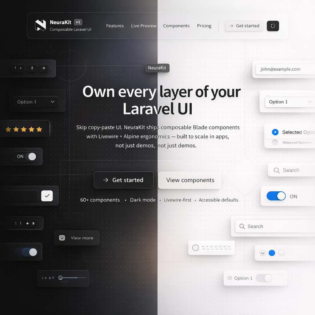
Empty State
Basic Usage
No messages yet
When you receive messages, they will appear here.
<neura::empty-state
    icon="inbox"
    title="No messages yet"
    description="When you receive messages, they will appear here."
/>
With Actions
No projects found
Get started by creating your first project.
<neura::empty-state
    icon="folder-plus"
    title="No projects found"
    description="Get started by creating your first project."
>
    <x-slot name="actions">
        <neura::button icon="plus">Create Project</neura::button>
        <neura::button variant="ghost">Import</neura::button>
    </x-slot>
</neura::empty-state>
Sizes
No documents
Upload your first document to get started.
No documents
Upload your first document to get started.
No documents
Upload your first document to get started.
Variants
No team members
Invite people to collaborate on this project.
No images
Drag and drop images here, or click to browse.
No data available
Start tracking to see your analytics here.
No results found
Try adjusting your search or filter criteria.
With Image
Welcome to your dashboard
This is where you'll see an overview of your activity.
<neura::empty-state
    image="{{ asset('images/illustration.png') }}"
    title="Welcome to your dashboard"
    description="This is where you'll see an overview of your activity."
>
    <x-slot name="actions">
        <neura::button>Get Started</neura::button>
    </x-slot>
</neura::empty-state>
With Footer
<neura::empty-state
    icon="clock"
    title="No recent activity"
    description="Your recent actions will be displayed here."
>
    <x-slot name="footer">
        <neura::link href="#">Learn about activity tracking</neura::link>
    </x-slot>
</neura::empty-state>
Common Use Cases
No results for 'lorem ipsum'
Try different keywords or remove filters.
Something went wrong
We couldn't load your data. Please try again.
All caught up!
You have no new notifications.
Drop files here
or click to browse from your computer
Props
| Prop | Type | Default | Description |
|---|---|---|---|
| icon | string | null | Heroicon name to display |
| image | string | null | URL of image to display instead of icon |
| title | string | null | Main heading text |
| description | string | null | Supporting text below the title |
| size | string | md | Size variant: sm, md, lg |
| variant | string | default | Visual style: default, bordered, card, ghost |
| compact | boolean | false | Remove max-width constraint for full-width display |
Slots
| Slot | Description |
|---|---|
| default | Custom content below description |
| illustration | Custom illustration/SVG instead of icon |
| actions | Action buttons (primary CTA) |
| footer | Footer content (links, additional info) |